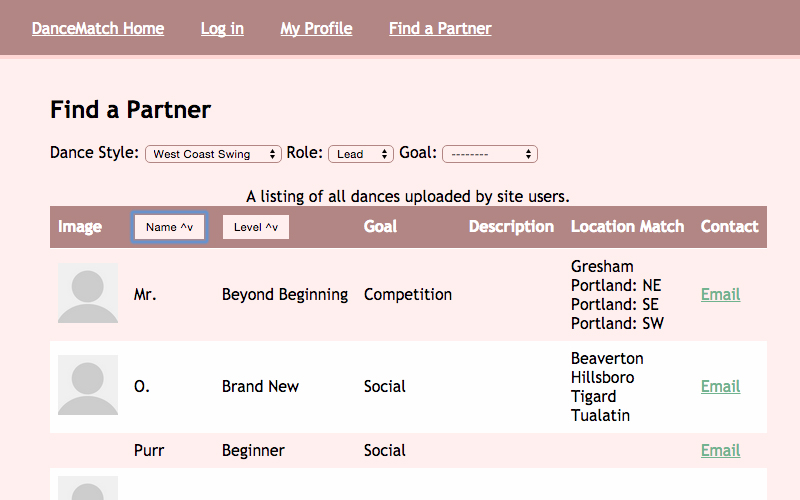
DanceMatch
An AJAX app built with Django to connect dancers with practice partners.
Skills: JavaScript, Python, Django, HTML, CSS, MVC, AWS Deployment
Project Details Visit SiteI am: Focused, observant, optimistic, empathetic developer with a drive to learn and improve.
I value: Respect, Honesty, Compassion, Curiosity, Responsibility, Self-Awareness
I'm working on: Node.js & Express, APIs
An AJAX app built with Django to connect dancers with practice partners.
Skills: JavaScript, Python, Django, HTML, CSS, MVC, AWS Deployment
Project Details Visit Site
Worked with a small team to build the front end of this Jekyll-based blog, news, and e-commerce site.
Skills: HTML, CSS, Wireframes, Responsive Design, Project Planning, Communication
Project Details Visit Site
A one-page responsive site for a small business. Built with Zurb Foundation 4.
Skills: Foundation, HTML, CSS, Wireframes, Project Planning, Photoshop, Communication, Customer Service
Project Details Visit Site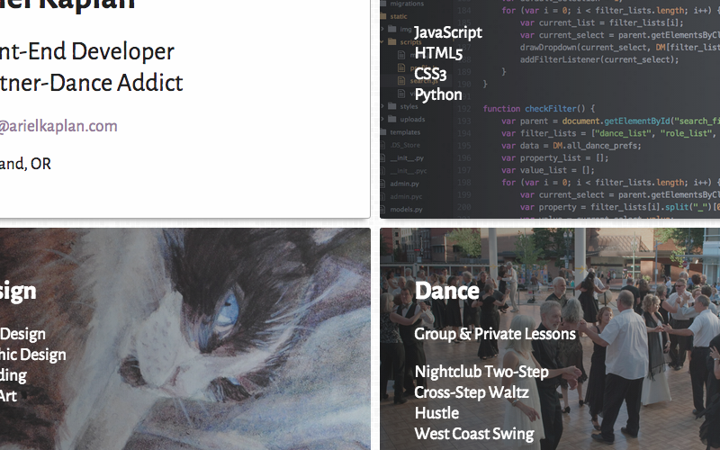
An entry page to my various subdomains. Mostly an excuse to learn Grunt and review Sass.
Skills: Sass, Grunt, CSS3, HTML5, Responsive Design
Project Details Visit Site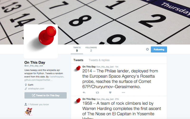
A bot that tweets a random event from this day in history. Uses Tweepy and the Wikipedia Python API wrapper.
Skills: Python, Terminal, Wikipedia API, Twitter API.
Project Details Visit Site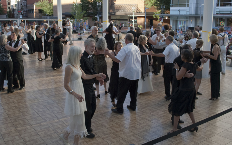
I've been teaching group classes and private lessons for nearly four years, currently out of Uptown Ballroom in Tigard. Prior to Uptown, I co-founded and hosted a twice-monthly social dance for about two years, and taught group classes at various places around Portland.
My favorite dances are Nightclub Two-Step, West Coast Swing, Cross-Step Waltz, and Hustle. I also do a smattering of other dances.
Visit Site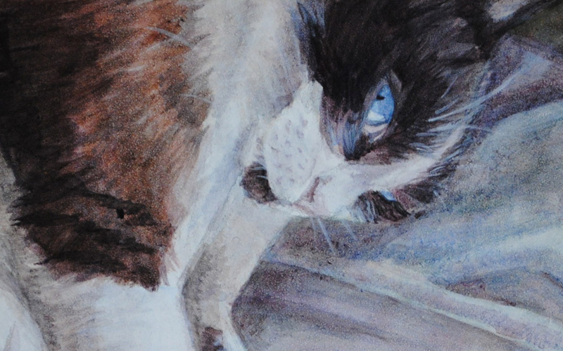
Although I don't do it too often these days, my first love was drawing. I spent some time as a pet portrait artist, enjoying the delicacy and precision of portraiture combined with cute animals. 'Cause cute animals.
I like to take an unreasonable number of photos with my Nikon D3000 whenever I go somewhere pretty.
Visit Site